aboriginal friendship centres of saskatchewan
Logo Design | Branding Applications | Website Graphics
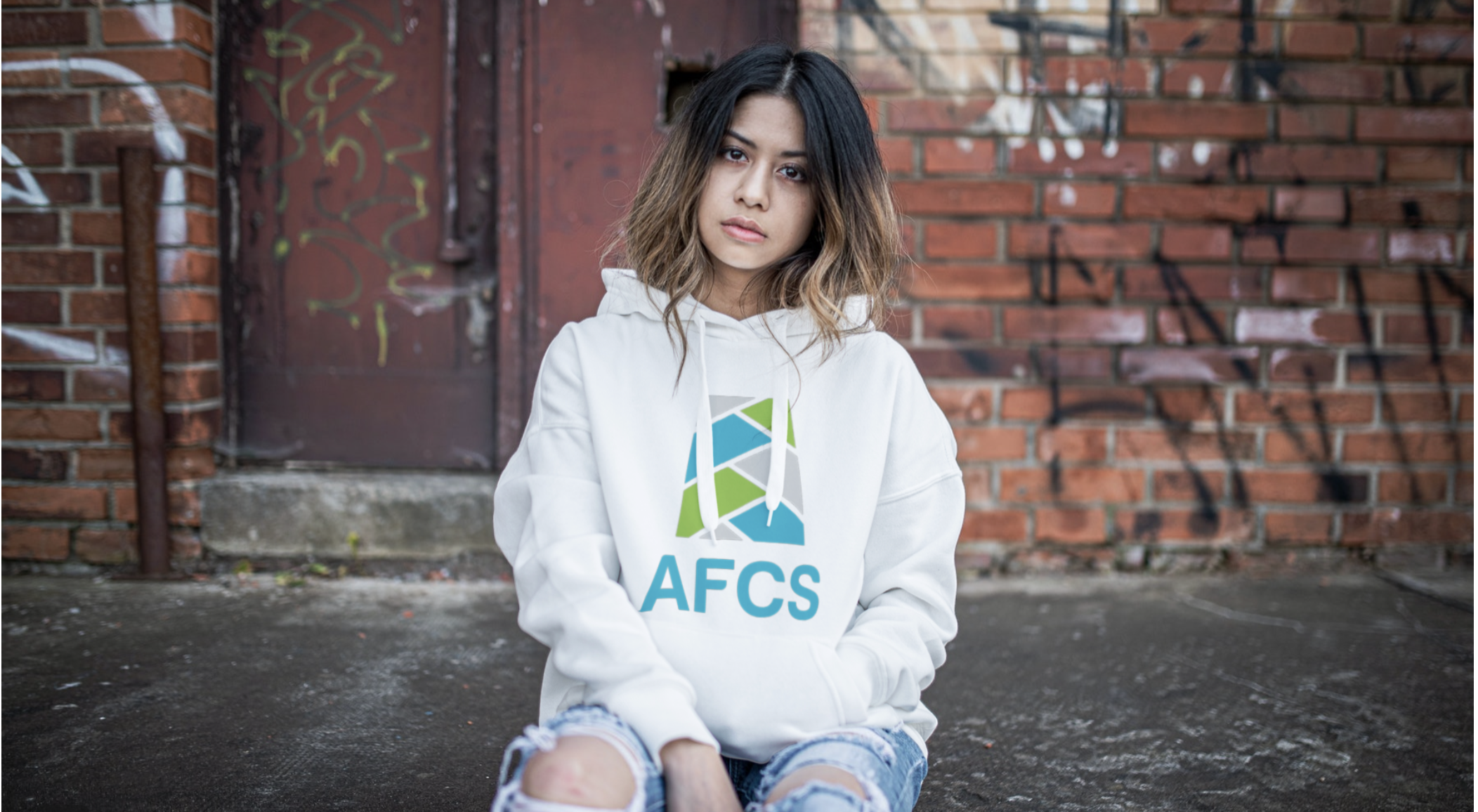
Early on in the re branding process, a discussion was had regarding the importance of designing a symbol that would be reflective of modern Indigenous peoples and consciously stay away from the usual overused symbols and tropes. At X-ing Design, the Indigenous way of deeply listening when others speak, is an integral part of our design process. As within the talking circle, when others hold the feather, it is our time to listen. We focused on including as many individual’s voices possible/needed into the consultation phase, the revision phase and right up to the final design delivery and beyond. We focused on bringing AFCS’ community vision to life in a simple, modern, meaningful design.
The final design reflects the deeper values shared by our peoples, and it draws it’s strengths from the idea that together we are stronger. Our resiliency as Indigenous peoples continues to strive as we drawn strength from community.
LOGO DESIGN - INSPIRATION | RATIONALE
colour variations
afcs awareness graphics


