symmetry public relations
Logo Design | Branding Guidelines | Branding Assets
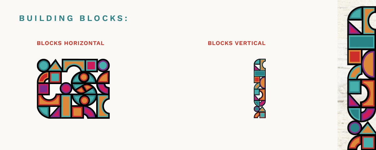
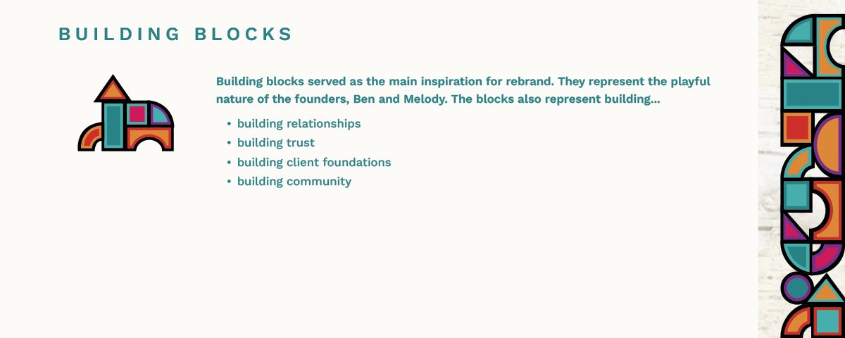
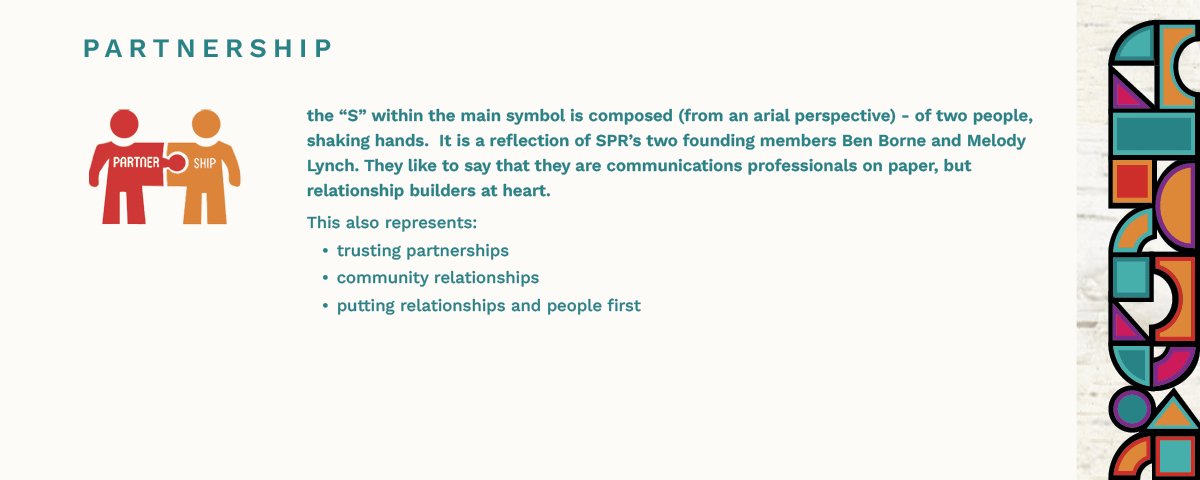
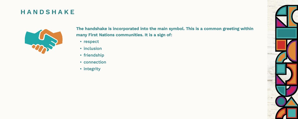
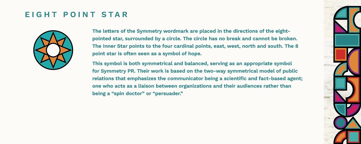
After a few years in business Symmetry PR, a communications and public relations consultancy, based in Saskatoon, Saskatchewan, was looking for a rebrand that matched their success in the industry. Our logo design and branding gave the firm a fresh new look and feel that matched their personality and their people first approach with their clientele. We worked closely with the founders to explore the firm’s unique character and values. We designed a logo with branding in mind. The centrepiece is a contemporary symbol, that is a modern, bold, simple mark that is both sophisticated yet playful. The concept is based on building blocks, the idea of building relationships, building trust, and building a foundation with their clients. The chosen colour palette is playful, welcoming and friendly reflective of the firm’s approachability.
symmetry PR Logo and Branding

To view the inspiration behind Symmetry’s brand click the arrow on the right side on the slider above.

One Colour Variations


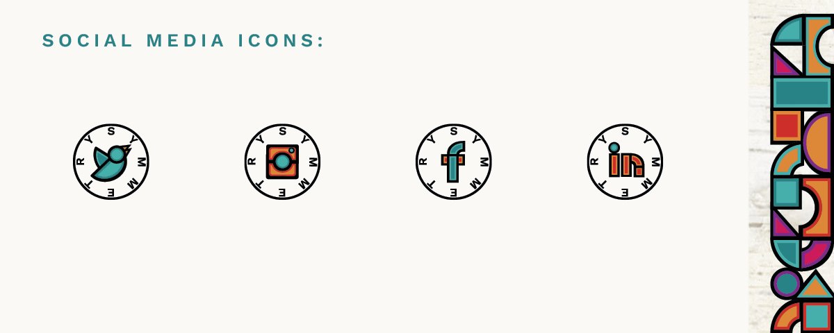
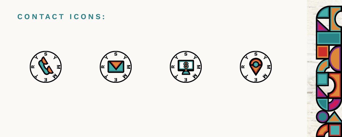
Branding Assets
The below set of branding assets when applied with consistency adds to SPR’s overall brand recognition.
To view these assets click the arrow on the right side on the slider below.