Nēwo Yōtina Friendship Centre
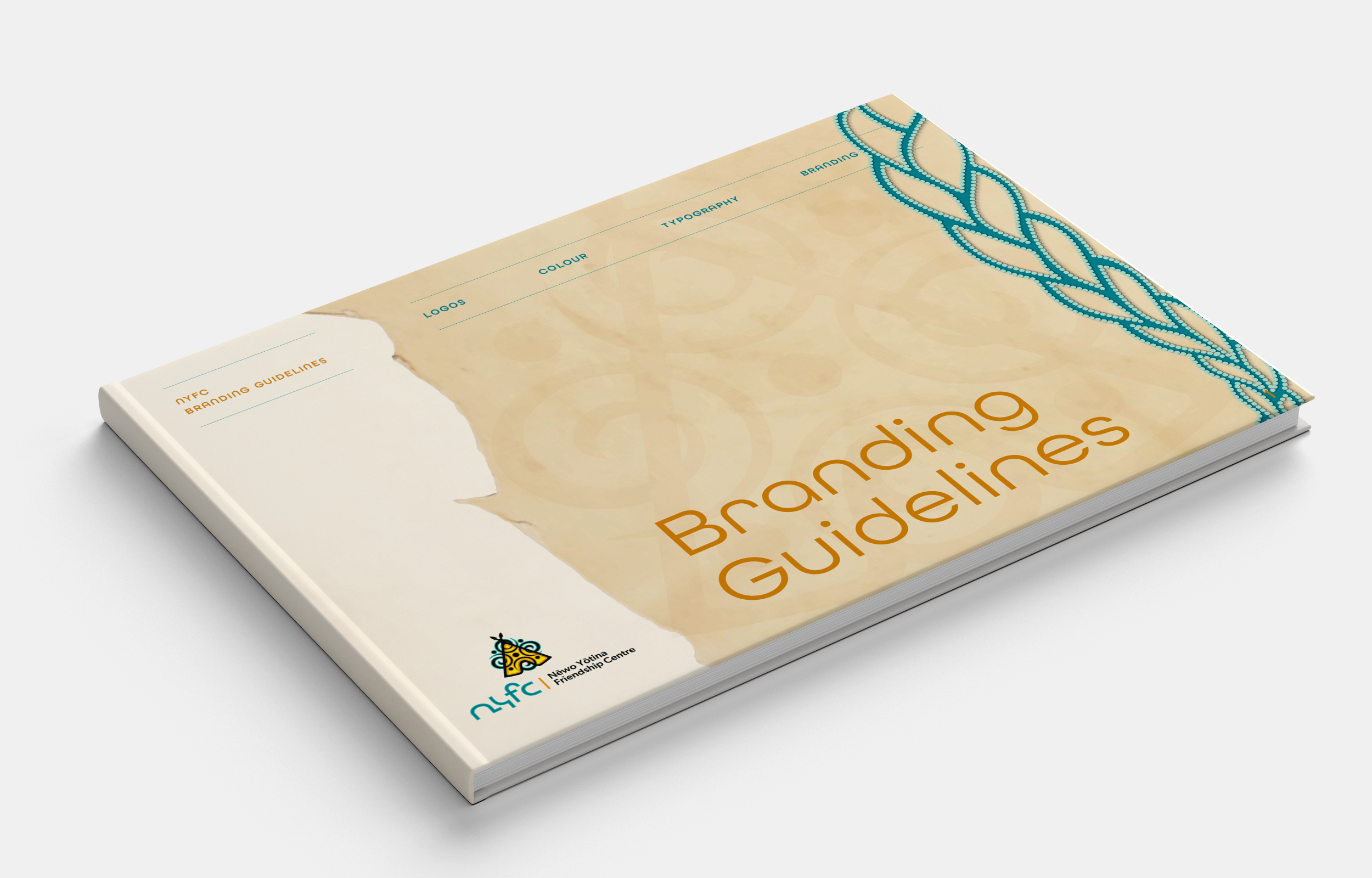
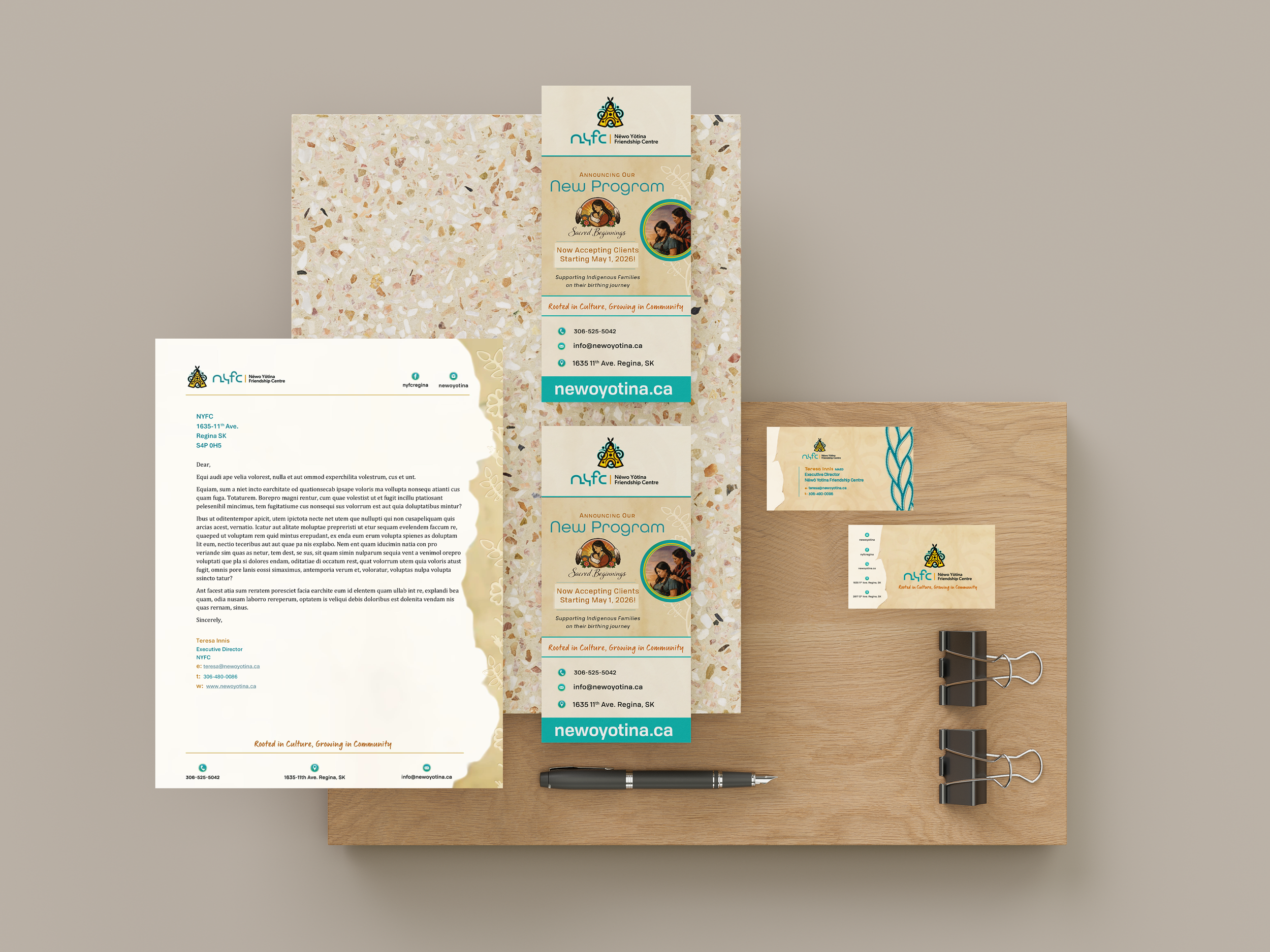
Logo Design | Branding Applications | Brand Guidelines

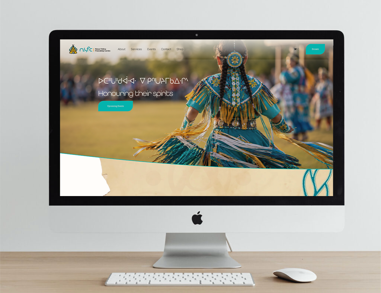
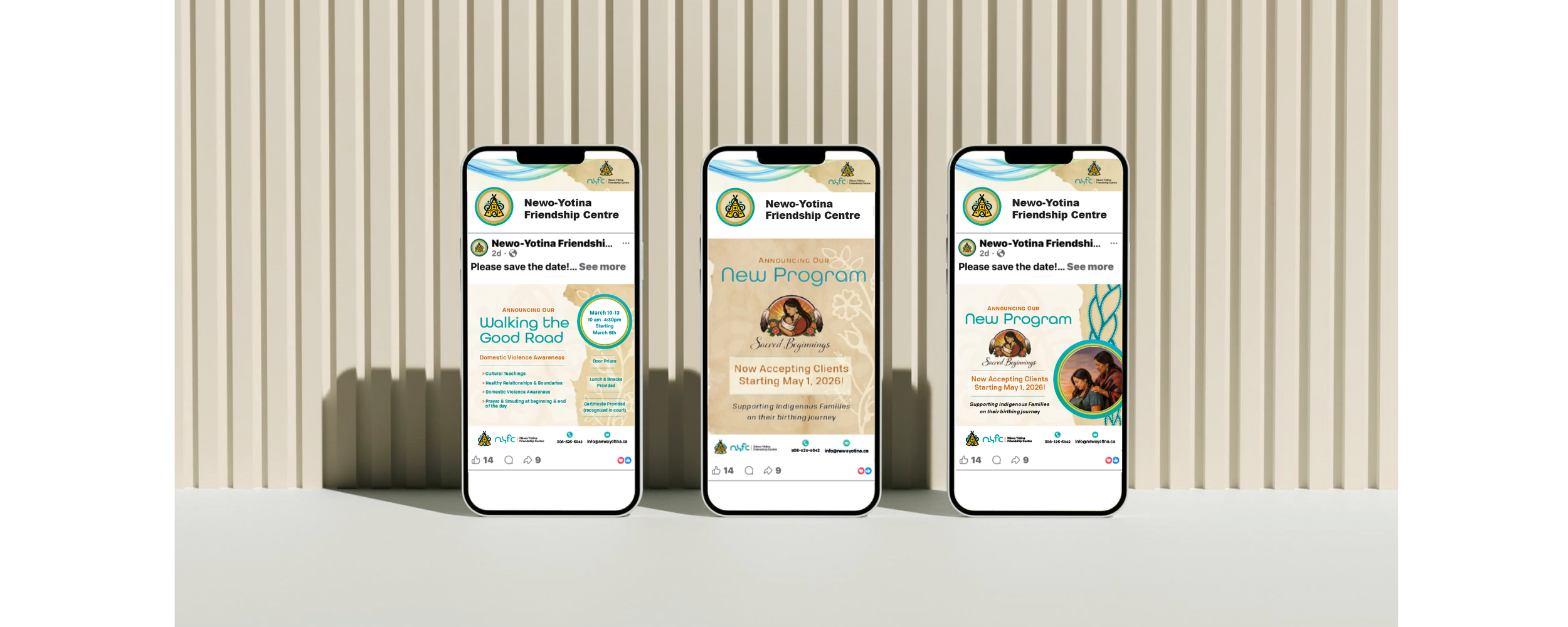
Nēwo-Yōtina Friendship Centre was looking for a logo design and rebrand that better represented who they are. Keeping in mind their values and unique character traits. They wanted community members to feel welcomed, respected and culturally safe. We worked closely with staff on the creative brief, that included all their ideas, asks and concepts.
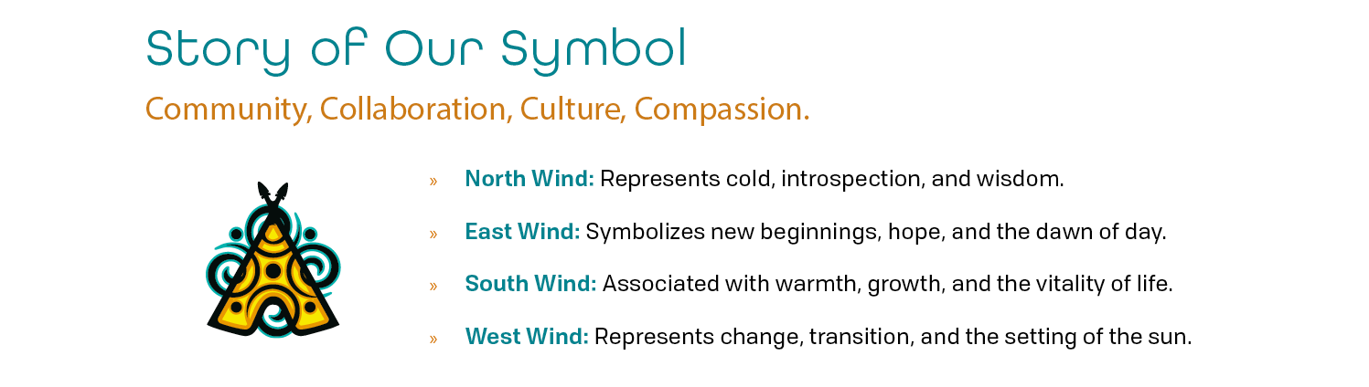
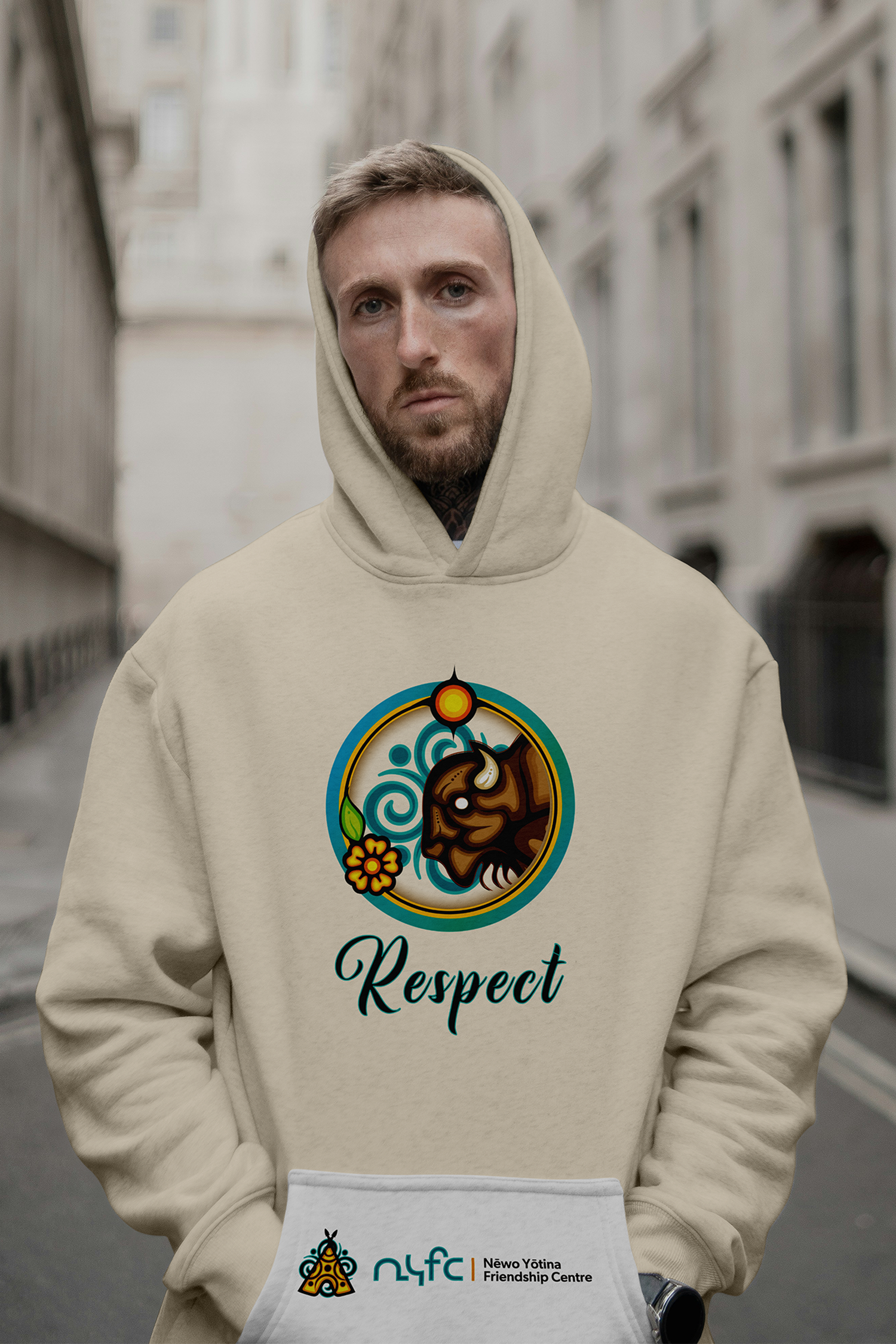
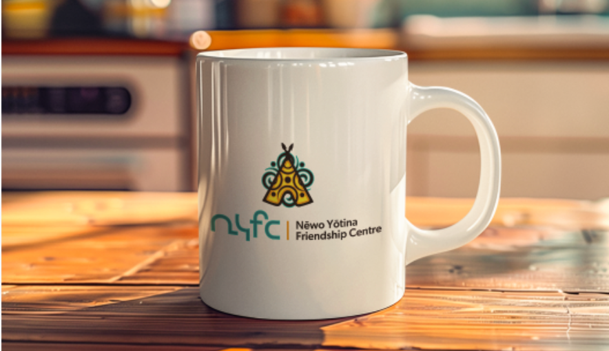
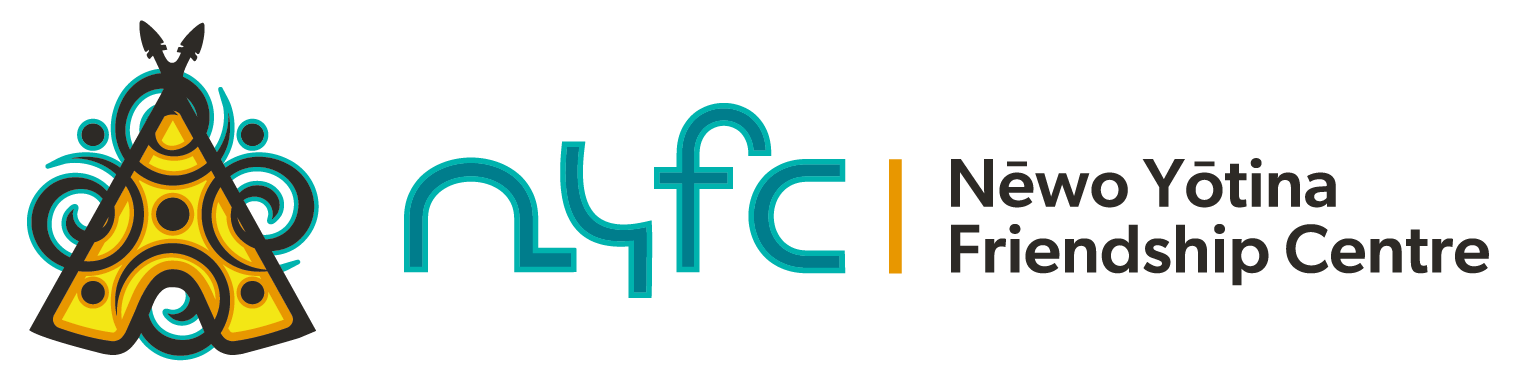
We designed a logo with branding in mind. The centrepiece is a contemporary symbol, that is a modern, bold, engaging mark that is both professional and welcoming.
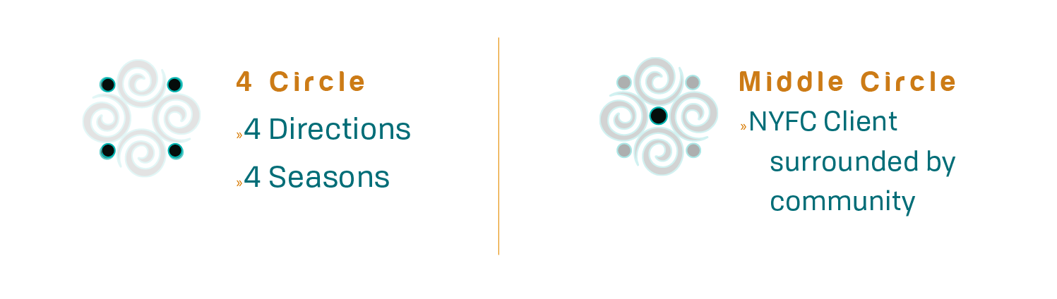
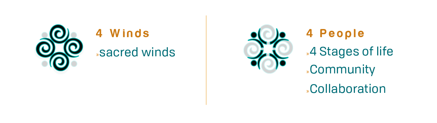
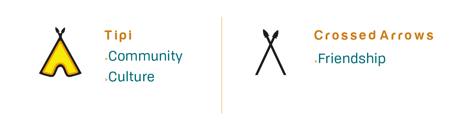
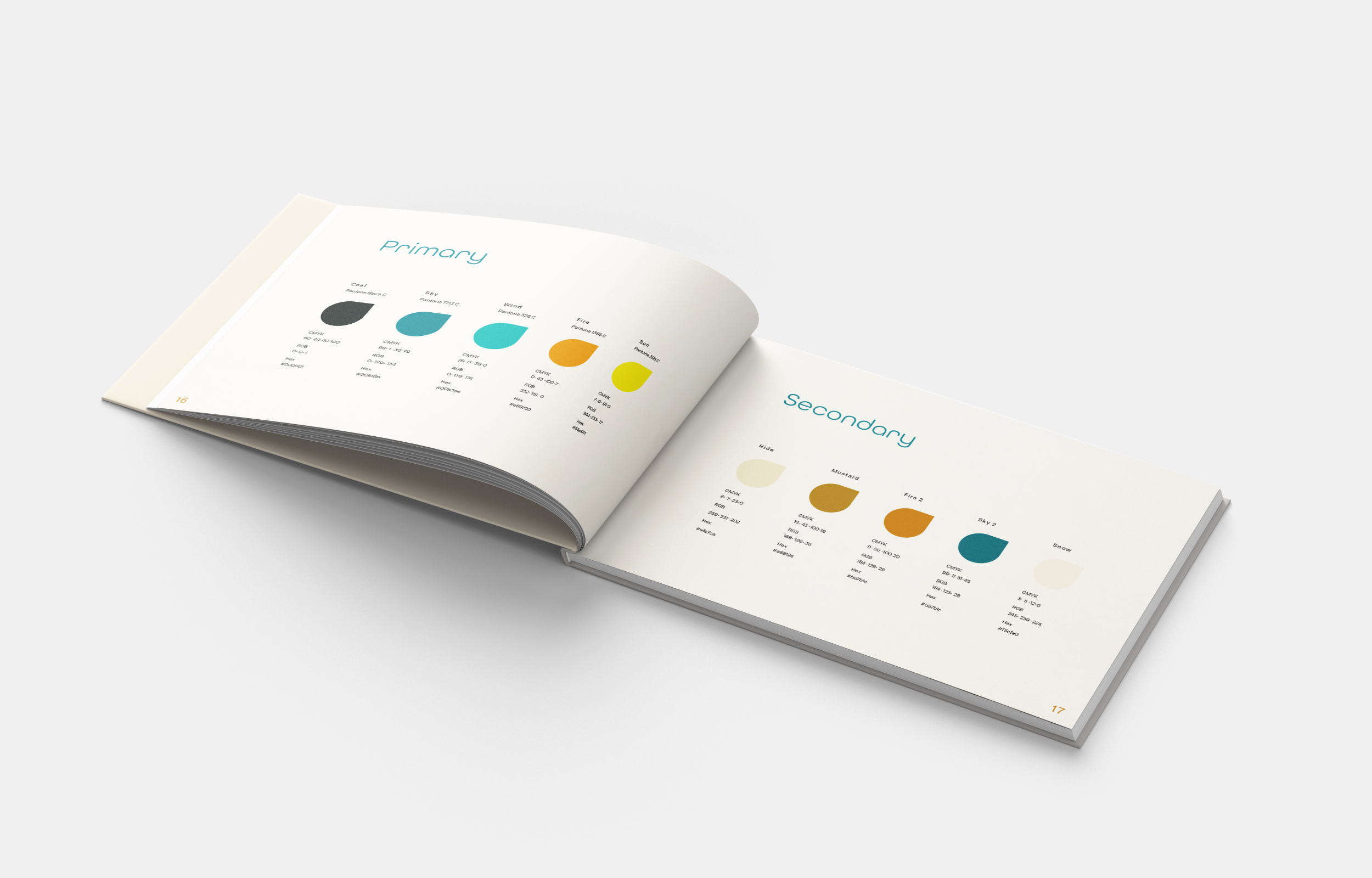
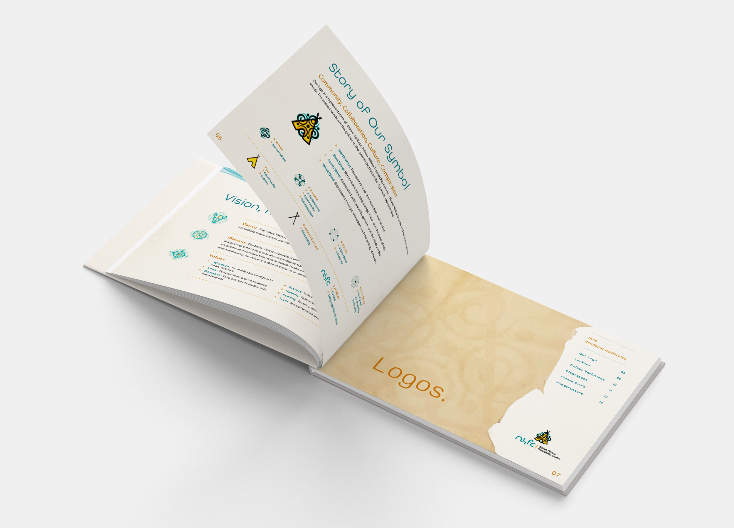
The inspiration is based on NYFC’s 4 pillars of; Community, Collaboration, Culture, Compassion. It incorporates the Cree translation of Nēwo Yōtina ( 4 winds). The chosen colour palette is welcoming and friendly reflective of the centre’s approachability.
LOGO DESIGN - INSPIRATION | RATIONALE